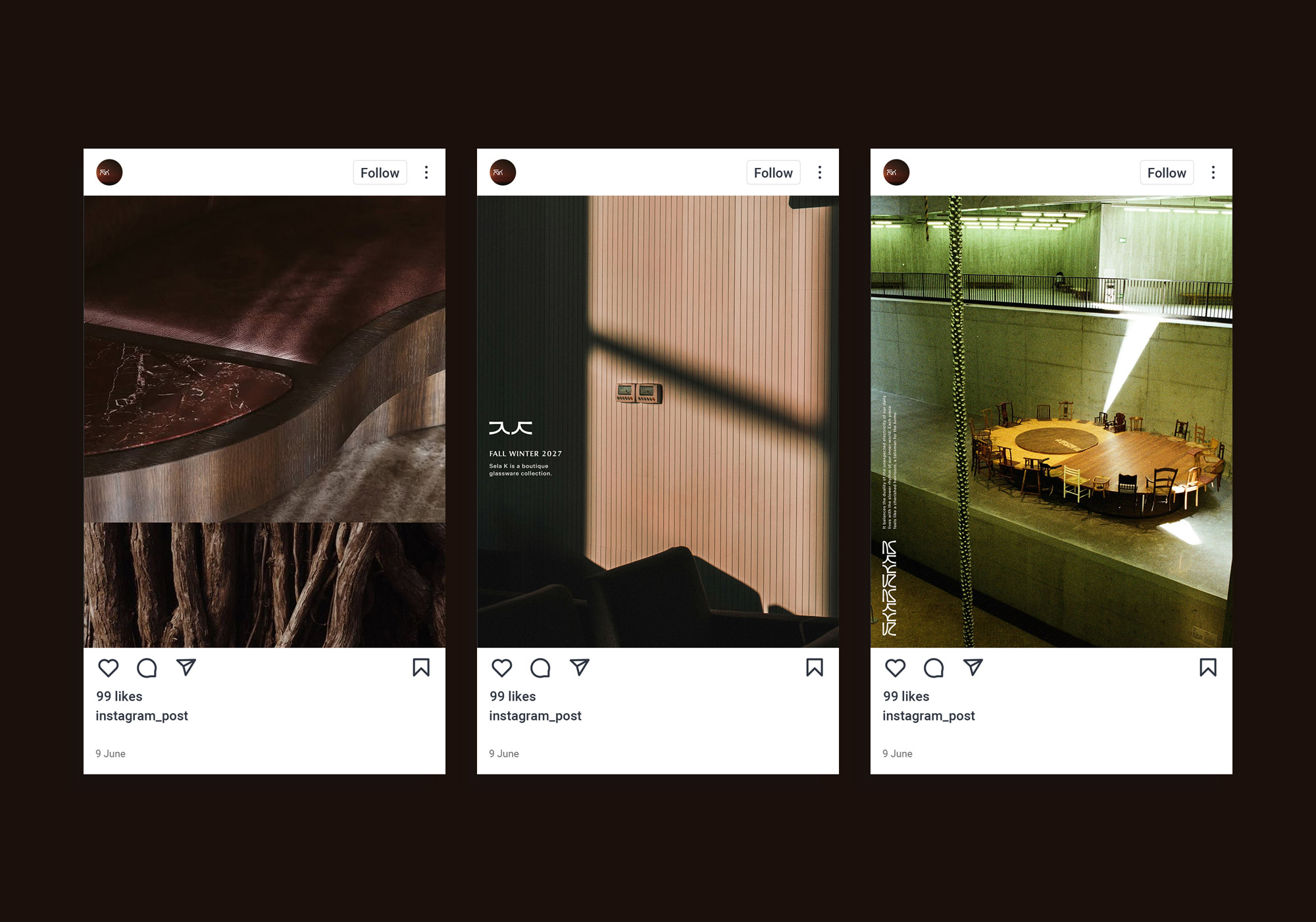
Sela K is a boutique glassware collection that blends elegant, audacious design with mindful indulgence.
It balances the duality of the unexpected electricity of our daily lives with the slower rhythm of our inner world. Each piece feels like a cherished heirloom, a talisman for the home.
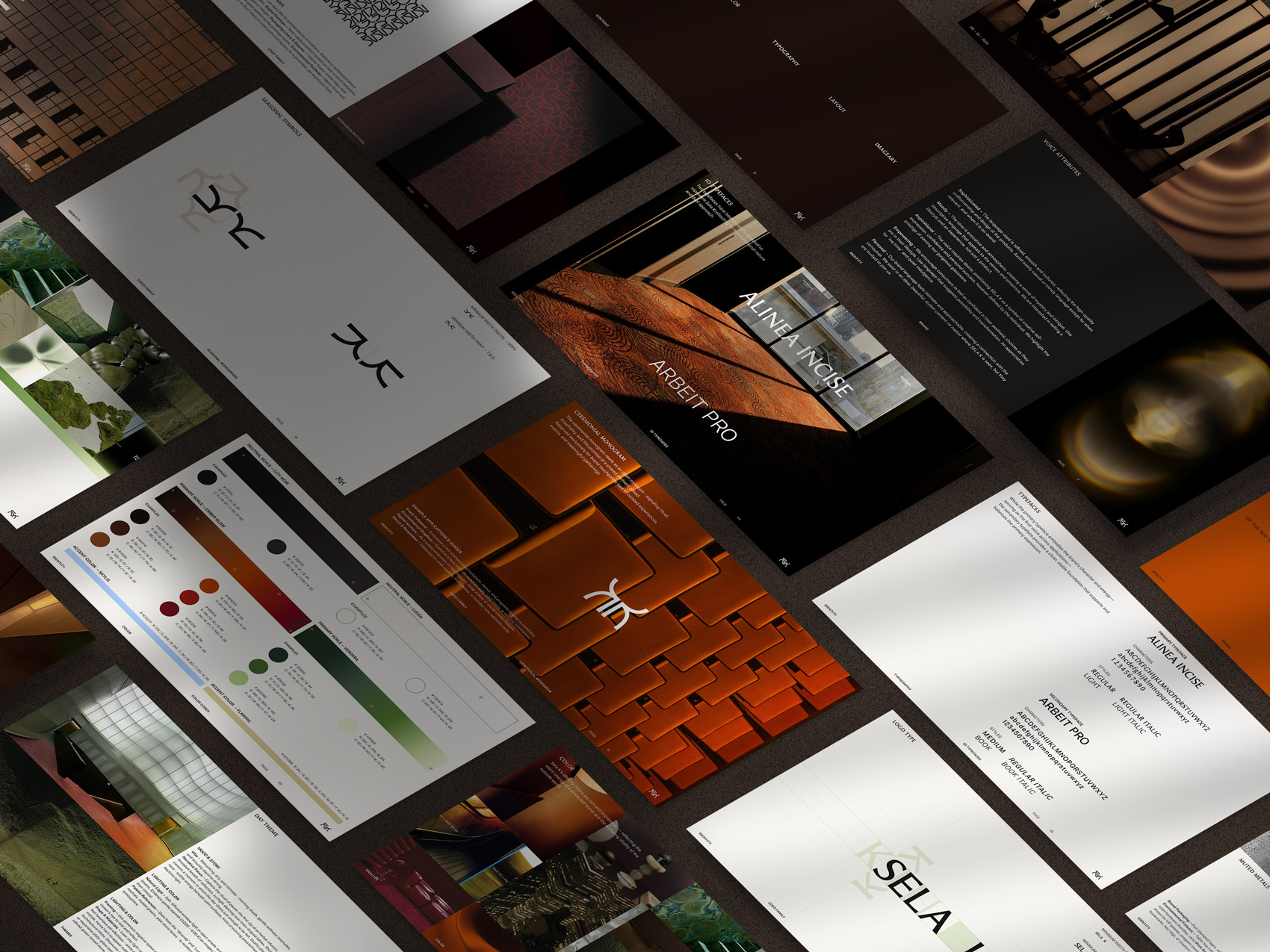
Development of the visual identity for the emerging brand, built around its core values of creativity, curiosity, mindfulness, and multifunctionality. This identity marks the foundation of the brand’s aesthetic and is currently being expanded — further applications will be showcased soon.
caty Timmerman
Visual design, Webdesign & development:
Benedikt Benrdt
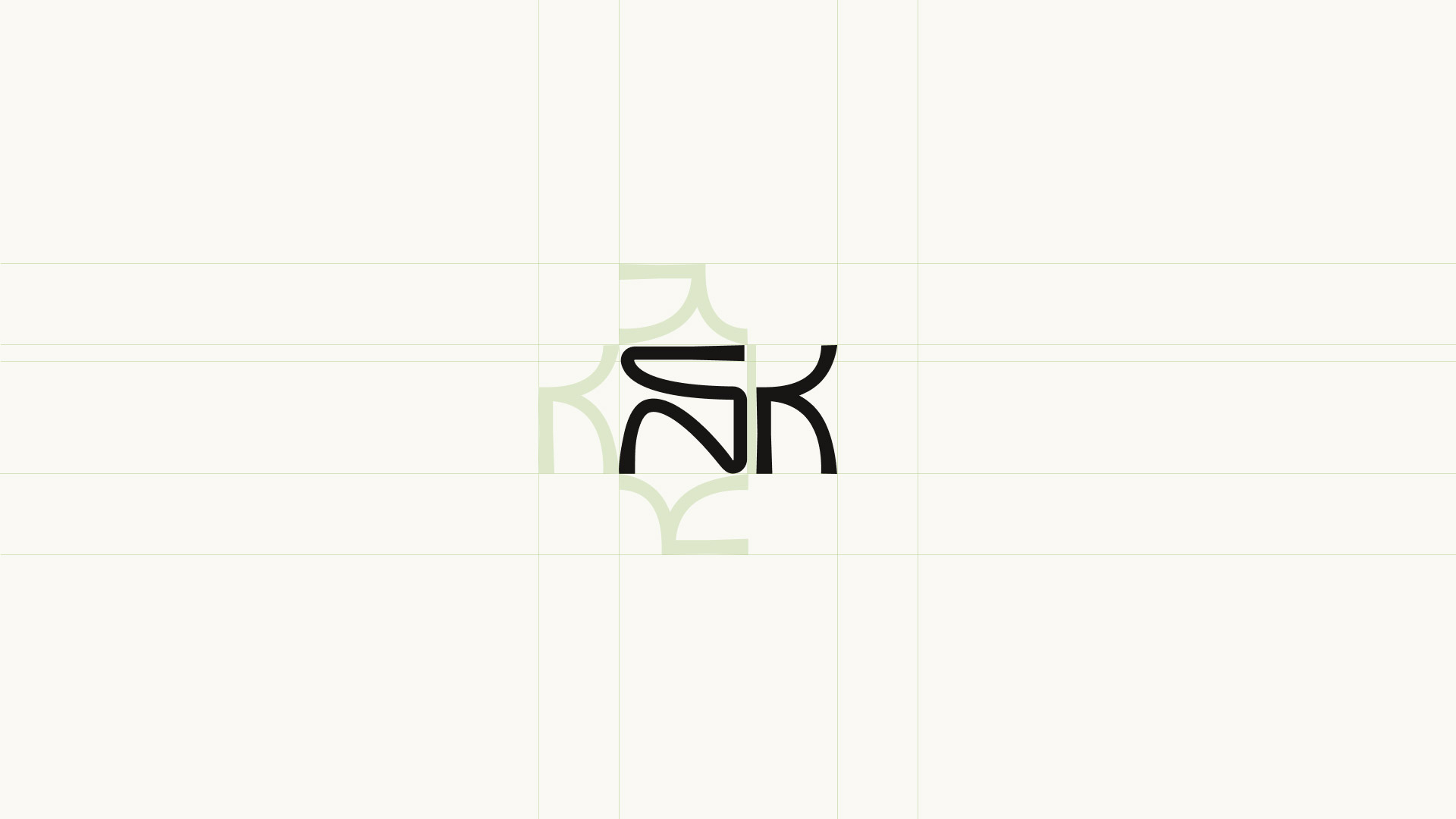
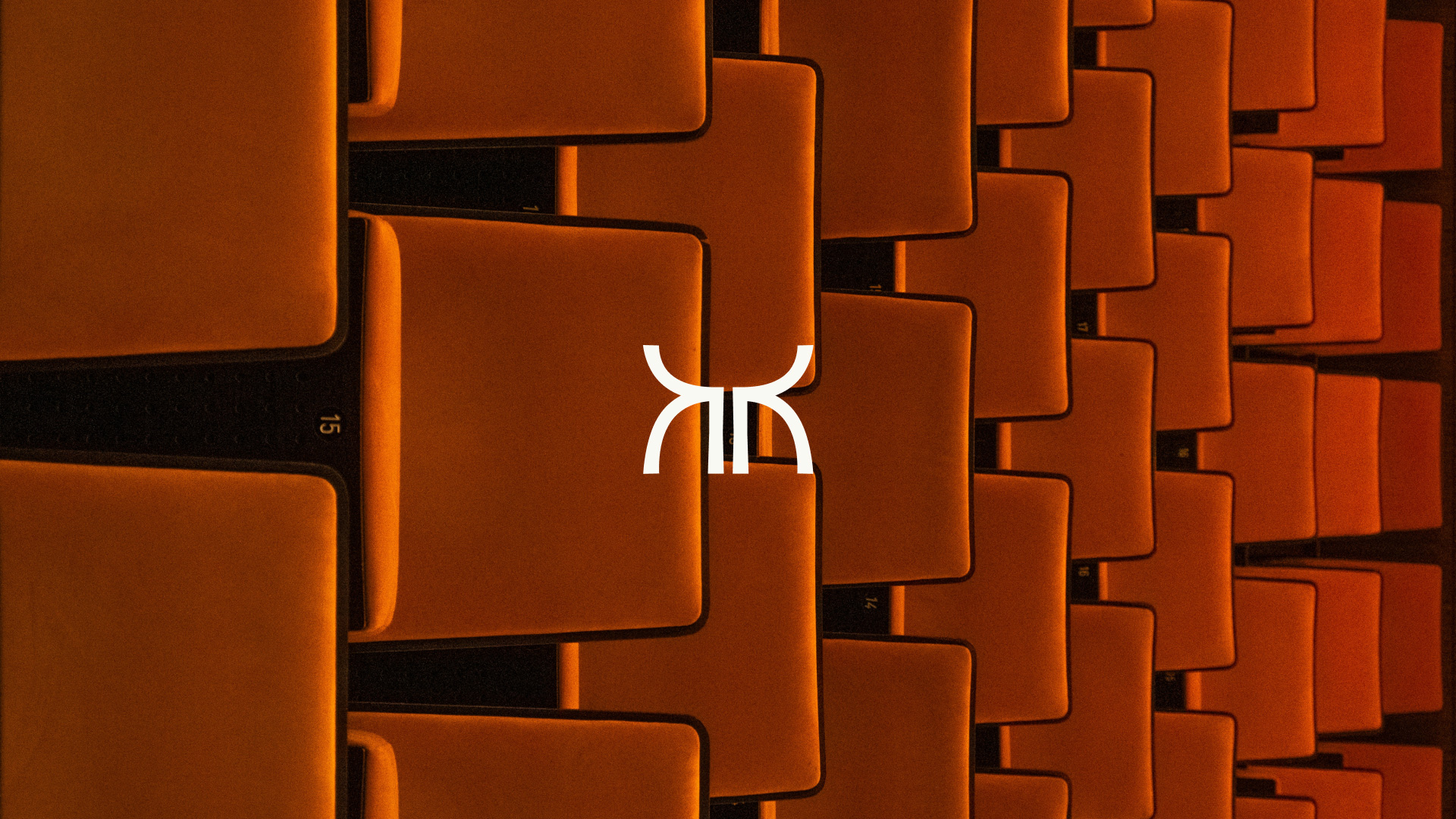
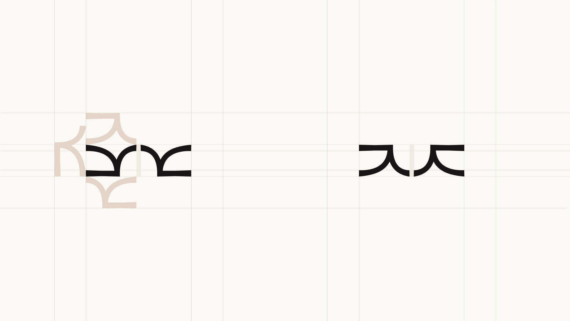
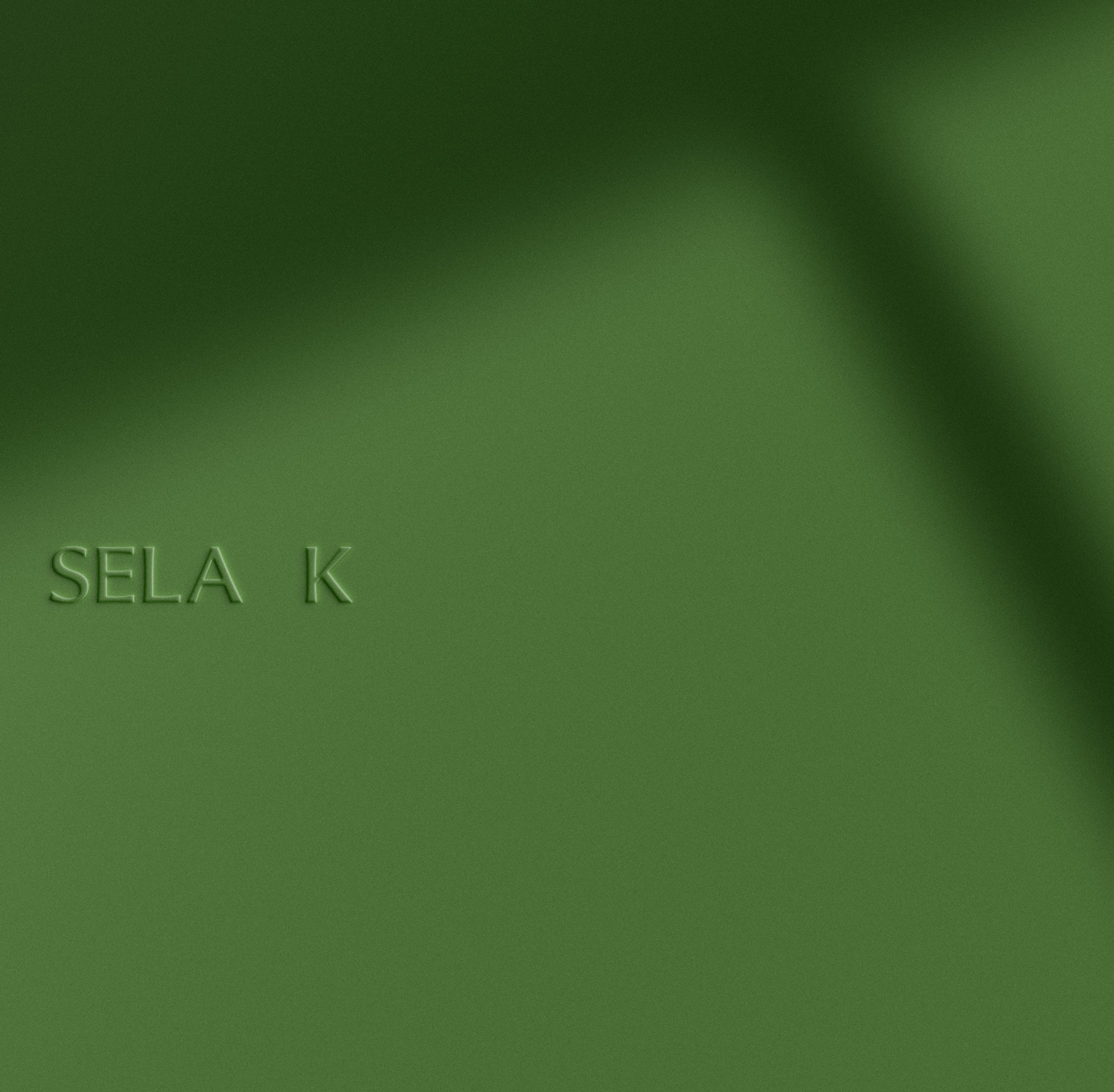
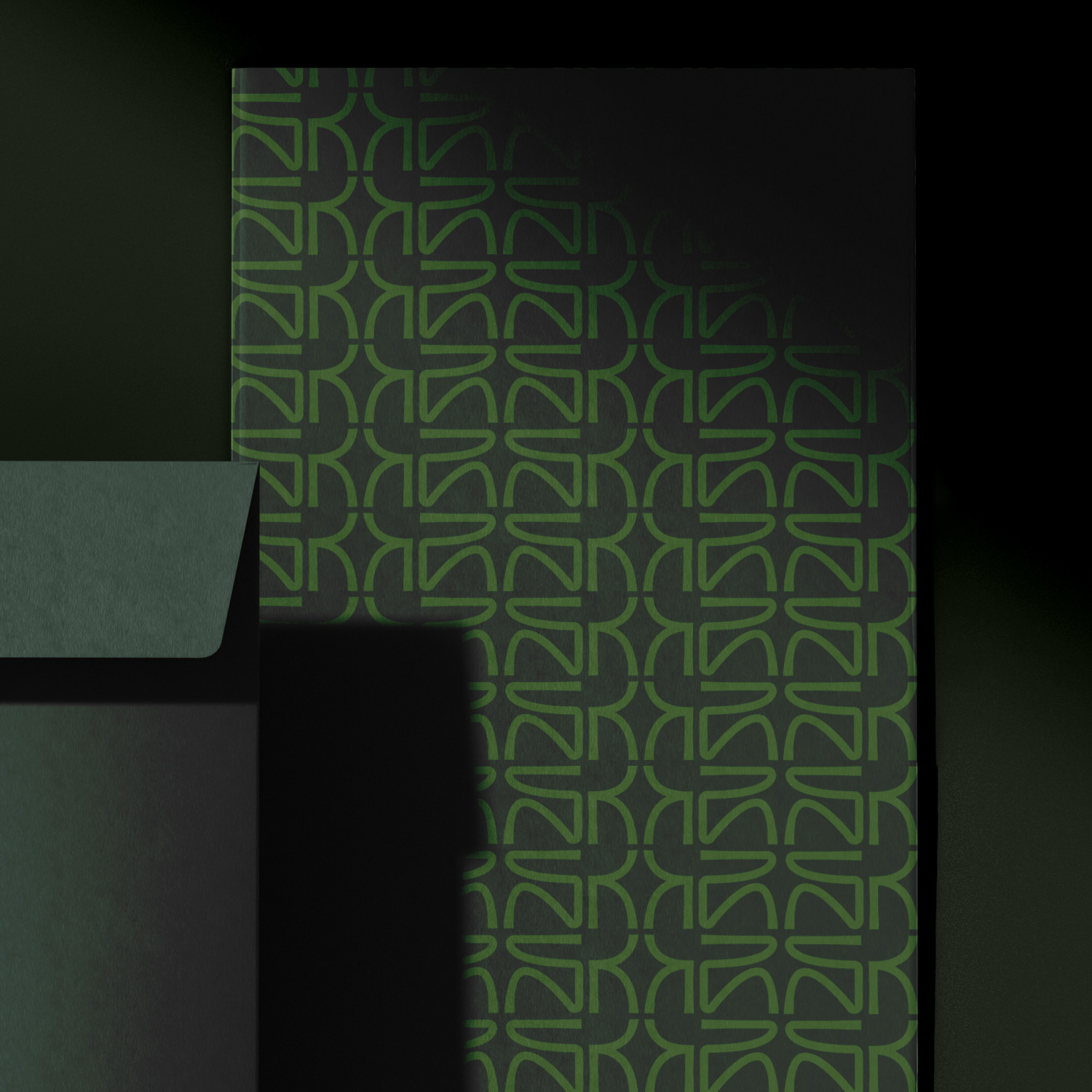
Sela K’s logo family communicates consistently across the brand and beyond, echoing the sculptural, handcrafted nature of its glassware designs.
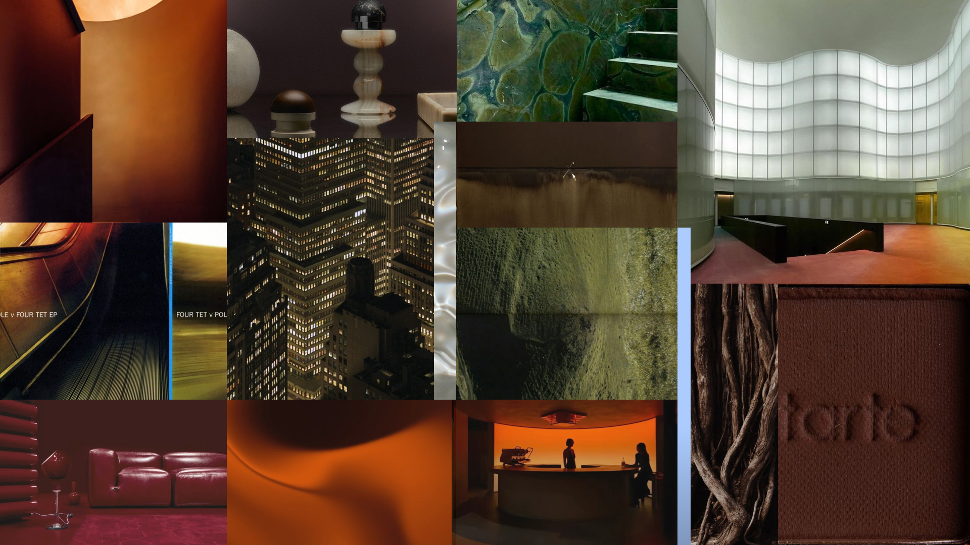
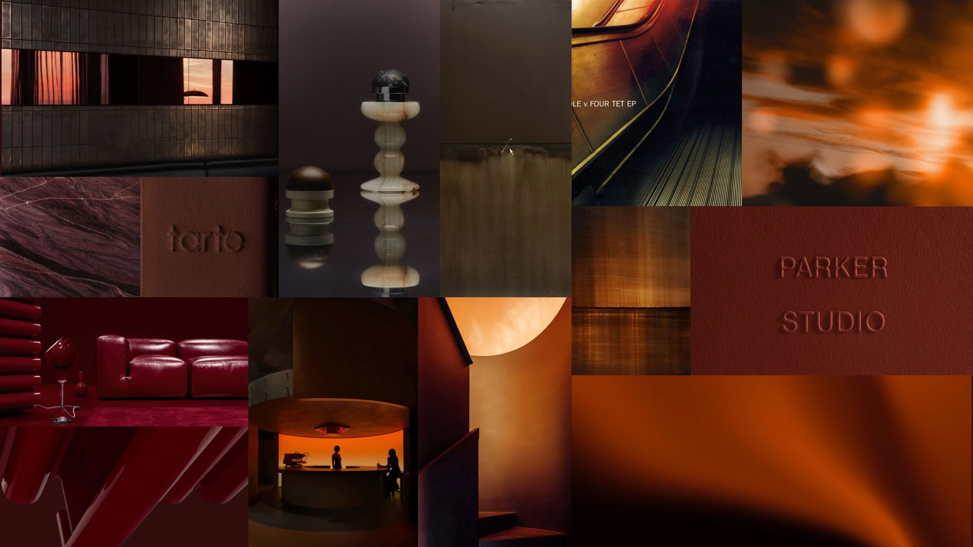
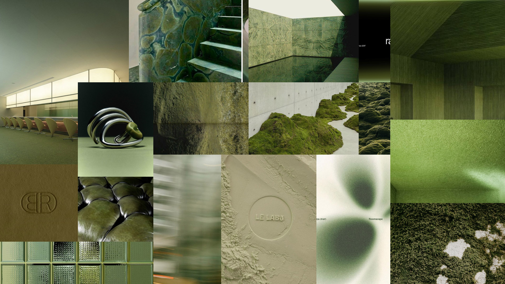
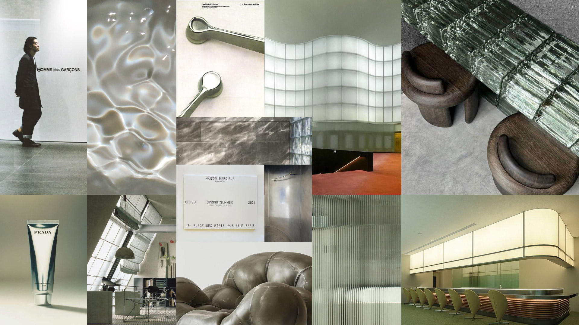
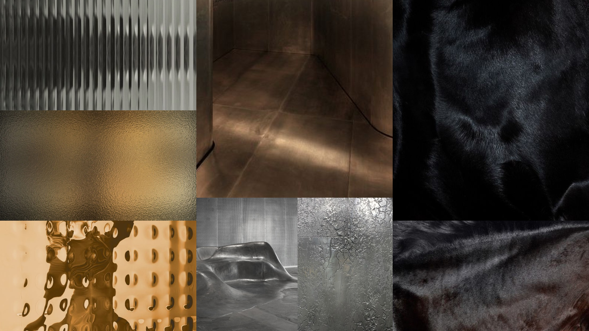
The brand’s primary and neutral identity colors are designed as dynamic scales, evolving alongside the brand’s growth and supporting its emotional, storytelling-driven approach.